How to ensure your logo does your business justice.
As the visual representation of your business, your logo should explain what you do as simply and as comprehensively as if you were giving a verbal or written explanation.
Unfortunately, when a business is first starting out and they are having their logo designed they are unlikely to have a firm grasp on their identity. This often leads to a logo being designed which does not tell their audience what they do and really is not going to help their business’ online conversion rate.
Despite the possibility that you may not understand your business’ identity and it may not even be trading yet there are still a couple of ground rule you can set in place to ensure your logo leaves your audience with a lasting impression from day one of your business.
Keep it simple
No matter how unique your business is and how much you have to say about it, the fact is that is would be totally counteractive to have a logo which took any sort of effort to figure out. All your logo needs to do is make it easy for your audience to associate your your business with the product/service and benefit it can provide.
Choosing the right logo colours
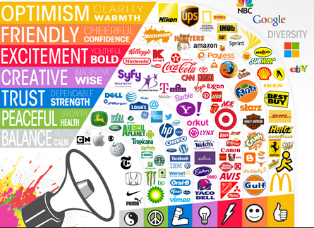
This can be a little bit tricky. Logo colour does not necessarily play a role in creating a visualisation of what your business does (in some cases it does). However, it can potentially make a huge difference to your online conversion rate.
Use the guide below to gain an understanding of what psychological effect colour can have in a logo and branding in general.
- Yellow: Optimism, youthfulness.
- Red: Energy, urgency
- Blue: Trust, Security
- Orange: Call to action, impulse
- Green: Wealth, relaxation
- Pink: Romance, feminine
- Black: Luxury, sleek
- Purple: Calm, beauty
Typography is everything
When you are choosing or developing fonts to be used in your logo, it is important to leave no stone unturned. Try absolutely everything you can think of. This should include; serif, sans-serif, italics, scripts and bold variations. The professional graphic designer you are working with should be more than capable of creating custom fonts to suit your needs and this is usually the best option if you want to achieve complete individuality in your logo.
Be inspired, don’t copy
Any designer would be flattered if you were to use their work as inspiration. directly copying is a completely different story. There are designers who use a lot of free vector art in their work under the creative commons license. Honestly, just because this is legal does not mean it will help you produce a great unique design. When looking at logo designs by others, take nothing more than basic ideas.
Although there is far more to logo design than just this, hopefully these few bits of advice should steer you in the right direction when it comes to having a logo designed for your business.
Now it’s time to get to it. Start seeking inspiration from logo designs that achieve what they set out to, work to get in contact with their designers and begin the process of developing your business’ long lasting identity.


