Perfect Landing Pages.
There are a number of specific steps you will need to follow in order to create a great landing page which is likely to convert. This post aims to dissect these steps and elaborate on how to best execute them in order to achieve maximum results.
Landing Page Headings
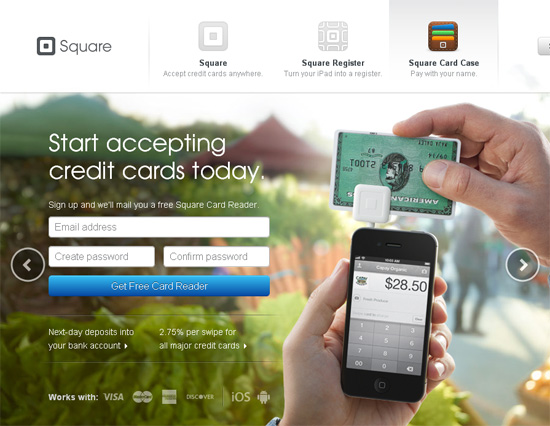
On any landing page, the heading is going to be the first thing that is read by the visitor. Therefore it has to be the best, the most persuasive and the straight forward benefit of what you are selling. When conceptualising your heading, keep in mind which keywords will lead visitors to your website from both PPC and SEO. You want your visitors to feel like they are in the right place, so the heading should reinforce what the ad titles or organic results are saying.
Once you know what your heading is going to say, an exact format needs to be developed which is going to generally suit the design of the landing page and be surrounded an ample amount of space to highlight importance.
The Hero Shot
The visual representation of your product or service can make or break a sale. The perfect hero shot will; show real humans and be interactive (zoom/rotate functionality). when deciding on the image, it is important to ensure an obvious relevance to the central theme.
Data Collection
A landing page needs more than just a regular CTA, it needs an additional CTA which collects data about your visitors (this counts as a conversion). You do this by implementing a form which is optimised for conversions.
When developing your form you need to ensure that your data entry points are simple to understand. Do not use any tech jargon – just keep it simple. A generic padlock graphic may seem like a corny feature, however it works establish trust and informs your visitors that you will not be selling their email addresses to companies marketing discount Viagra. As a rule of thumb in landing page forms, more is less. You are yet to deliver any real value to your visitors so don’t ask too much of them and you will notice an increase in conversions.
The Call To Action (CTA)
At some point, you want your visitors to stop reading and do something. The positioning of your call to action is mission crucial. Websites which are focused on converting above the fold (before the user scrolls down the page)are up to 80% more likely to convert.
The wording of your call to action can significantly affect your conversion rate. Perfect CTA wording will inspire users to consider benefits rather than cost. Once you have your wording sorted you can run slit tests with subtle CTA changes such as colour, size and alignment. Not dissimilar to wording, these changes can make a huge difference to conversions.
The Benefits
As much as you would love to write for hours about your amazing product or service, your potential customers are highly unlikely to ever read it. It is far more likely that your visitors are scanners that would benefit more from reading 4-6 straight to the point dot points.
Always remember to highlight the product benefits rather than the features. As the saying goes, “Nobody who bought a drill wanted a drill. They wanted a hole.” When you are writing your dot points make sure you are thinking about what your target market really need – not what you want to sell them.
Landing Page Safety Nets
Not all of your traffic will be ready to convert after visiting your landing page for the first time – This does not mean you have lost them forever. Asking your visitors to ‘Like’ you on Facebook of follow you on Twitter is far less demanding than asking them to hand over money or even fill in a form.
As a deal closer, social media usually is not highly effective. This can change once a fan or follower has previously visited your website and been exposed to the benefits of your product or service. As they view your social content over and over, they will become a better prospect and increasingly likely to convert.
Source: KISSmetrics


